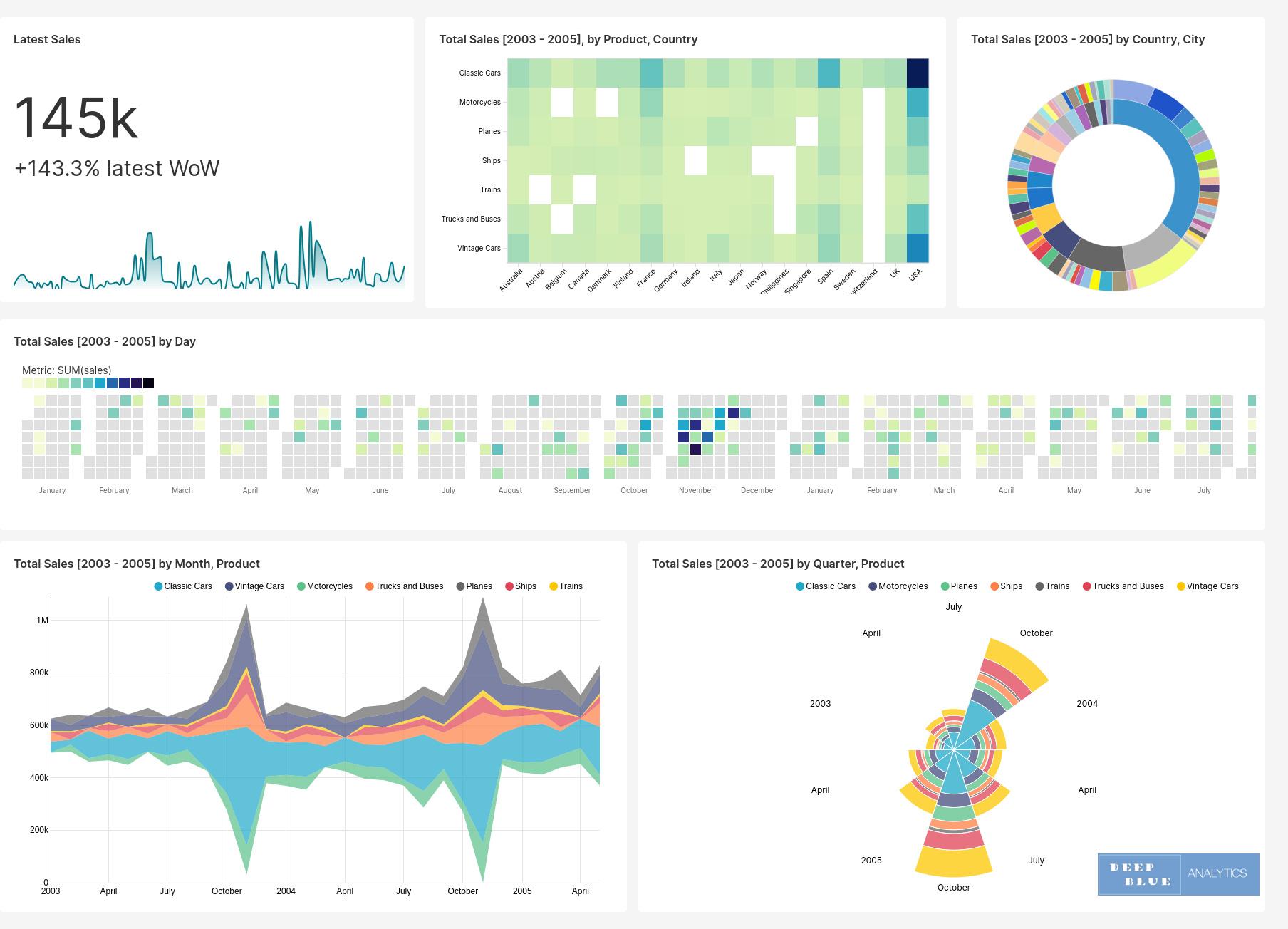
Fig 1. Dashboards are a configurable arrangement of interactive data visualisations which operate in concert to give a multi-faceted view of the underlying dataset. Vehicle sales between 2003 and 2005 is the subject of this example dataset, and in the above snapshot of the dashboard we have six different data visualisations each of which tell a slightly different story about the data. Each of the above six visualisations are interactive and some snapshots of this interactive behaviour can be found in later slides (see Figs 5, 6, 7 and 8.)
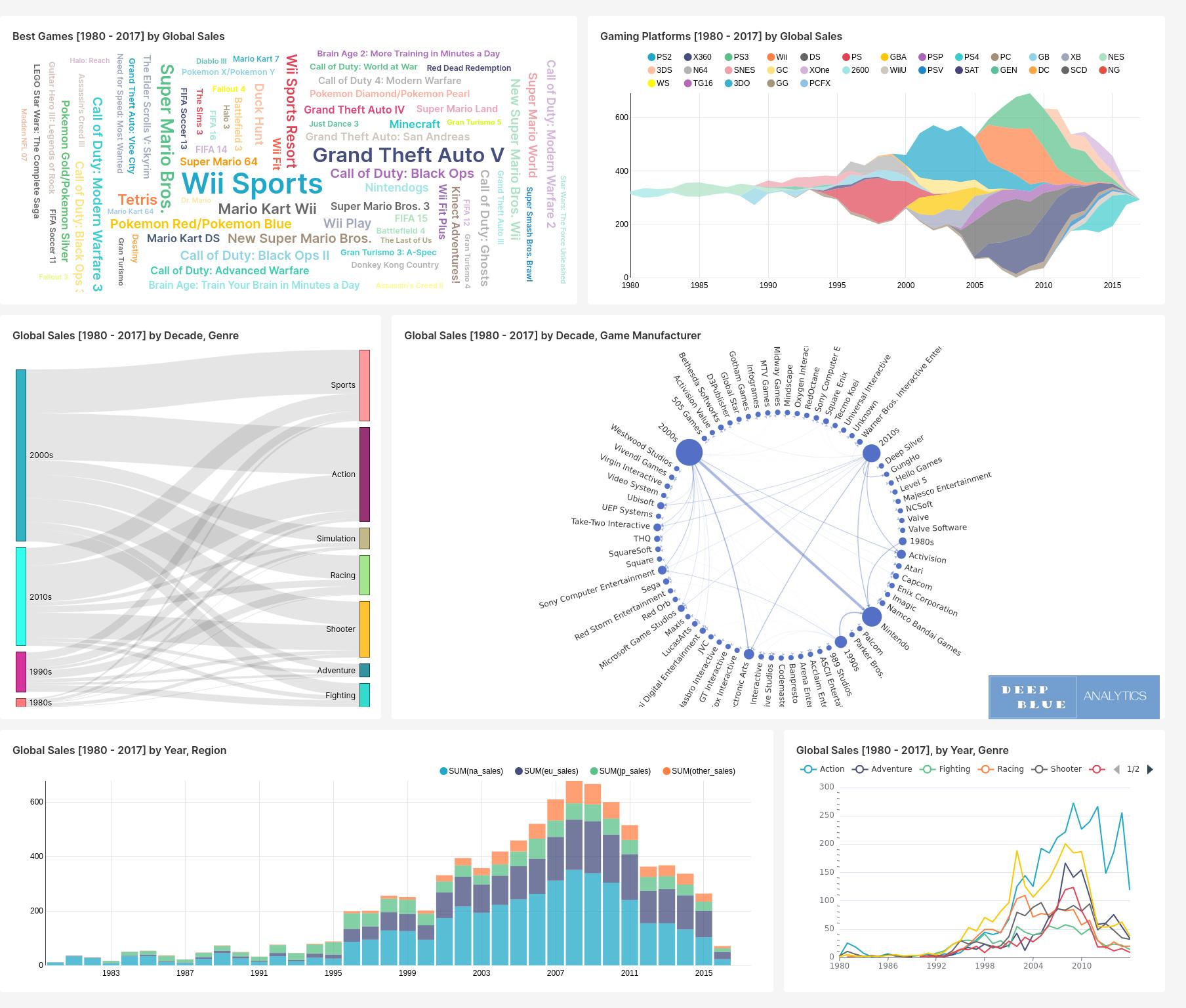
Fig 2. Video game sales between 1980 and 2017 is the subject of this dataset, and in the above snapshot of the dashoard we have seven different data visualisations. Of particular note is that global sales peaked in 2008 at over $600 billion but by 2017 this figure had fallen to approx. $100 billion, the same as it was in 1995. Each of the above visualisations are interactive and some snapshots of such behaviour during interaction can be found in later slides (see Figs 9, 10 and 11.)
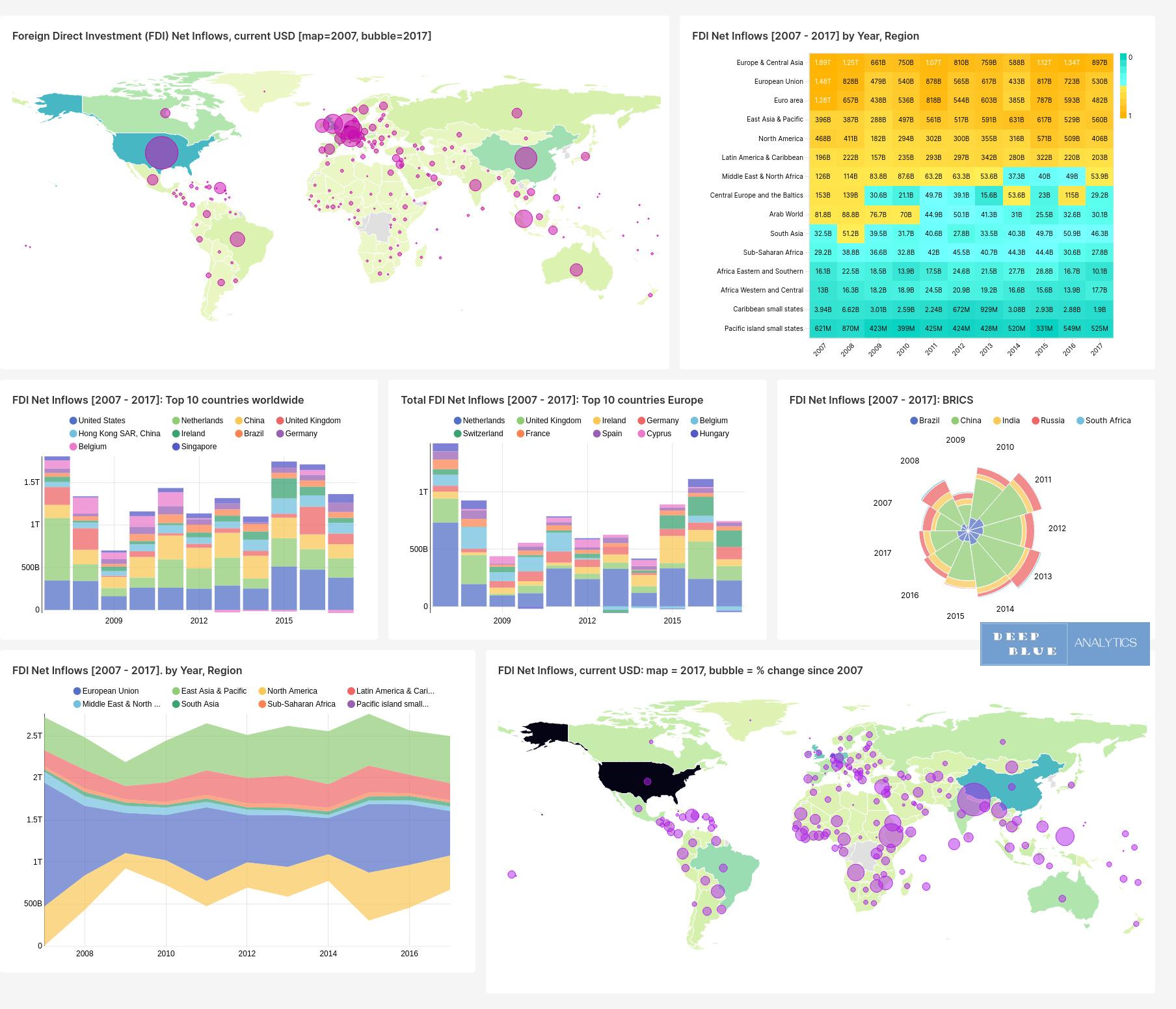
Fig 3. Foreign Direct Investments by country between 2007 and 2017 is the subject of this dataset taken from the World Bank, and in the above snapshot of the dashoard we have seven different data visualisations. Of particular note is the map on the bottom right which identifies those countries with the largest increase in FDI across the 10 year period, namely: Nepal = 3420% and Ethiopia = 1810% being the highest increases worldwide, with Cyprus = 628% and Switzerland = 294% being the highest increases in Europe.
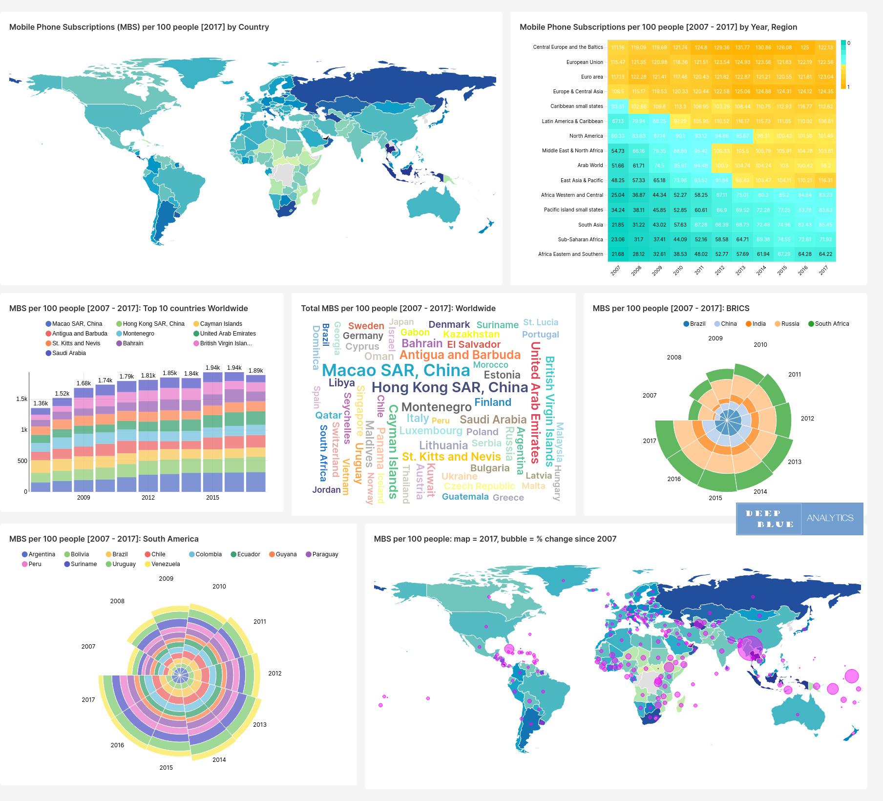
Fig 4. Mobile Phone Subscriptions by country between 2007 and 2017 is the subject of this dataset taken from the WorldBank, and in the above snapshot of the dashoard again we have seven different data visualisations. Of particular note is the word map at the centre, which communicates its data story in a particularly succinct manner.
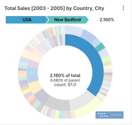
Fig 5. A close up of the visualisation at the top right of the dashboard in Fig 1. (vehicle sales between 2003 and 2005), during a mouse-over event. This visualisation is a kind of two-ringed pie-chart, categorising sales by both country and by region or city within that country. The mouse-over interaction selects the country (USA) and the state (New Bedford), and identifies both the proportion of total sales generated from this location and the number of units sold there.
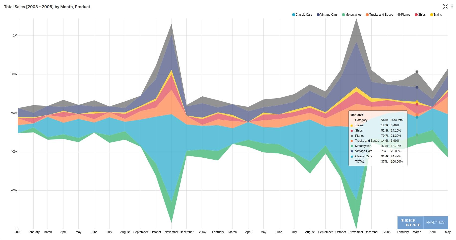
Fig 6. A close up of the visualisation at the bottom left of the dashboard in Fig 1. (vehicle sales between 2003 and 2005), during a mouse-over event. This visualisation follows the changing fate of total sales on a month-by-month basis, and then sub-dividing the monthly total by vehicle type. The mouse-over event pops-up a table with a snapshot of sales per vehicle type per month in question
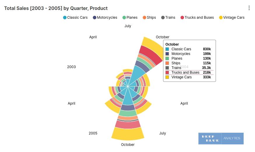
Fig 7. A close up of the visualisation at the bottom right of the dashboard in Fig 1. (vehicle sales between 2003 and 2005), during a mouse-over event. This visualisation is a kind of stacked circular bar chart, whose segments vary in physical size according to total sales. The mouse-over pop-up changes per segment and shows a table with sales per vehicle type.
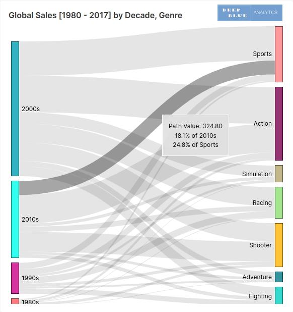
Fig 8. A close up of the visualisation at the centre left of the dashboard in Fig 2. (video game sales between 1980 and 2017), during a mouse-over event. This visualisation provides logical flow between decade and video game genre in order to help analyse sales. The mouse-over event highlights the pathway relating to the logical flow, and also provides proportions of total sales by decade and separately the proportion by genre.
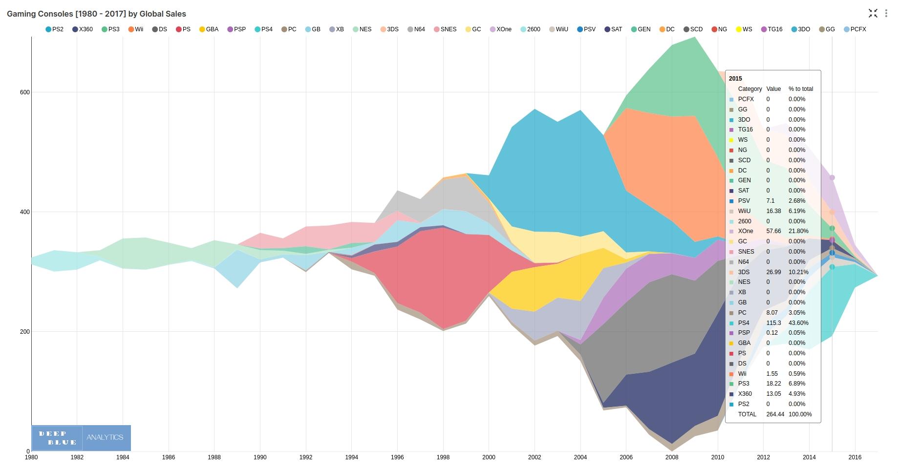
Fig 9. A close up of the visualisation at the top right of the dashboard in Fig 2. (video game sales between 1980 and 2017), during a mouse-over event. It is instructive to note how much information is captured in this single visually-engaging chart. The mouse-over event pops up a table of all global sales broken down by gaming console for the year in question.
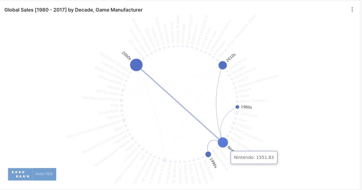
Fig 10. A close up of the visualisation at the centre right of the dashboard in Fig 2. (video game sales between 1980 and 2017), during a mouse-over event. This visualisation links video game manufacturer to the decade(s) in which they sold games (80s, 90s, 00s, 10s), and the amount of global sales achieved in that decade. The mouse-over event identifies all the logical flow connections to and from that node in the chart (i.e. either video game manufacturer or decade), and the total sales associated with that node.