Fig 1. Interactive OHLC time-series chart of 2 years of the S+P-500: 2017 and 2018 represented in 1 day candles, with the both moverage average and bollinger bands (2 standard deviations away from moving average) overlaid. The lower chart shows volume traded in $billions for each day in the 2 year period. Various modes of interaction are possible, e.g. mouse click + drag highlights a section of interest, and zooms in. See Figs. 2 and 3 for examples of this. The chart at the bottom is simply an overlay of the OHLC and the Volume charts, and remains unchanged regardless of the degree of zoom in the main charts. It can also be used to track the zoomed section sideways.
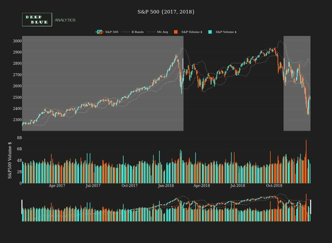
Fig 2. Screenshot taken of Fig. 1 during a mouse click + drag interaction, the result of which will then isolate a section of the graph for closer inspection.
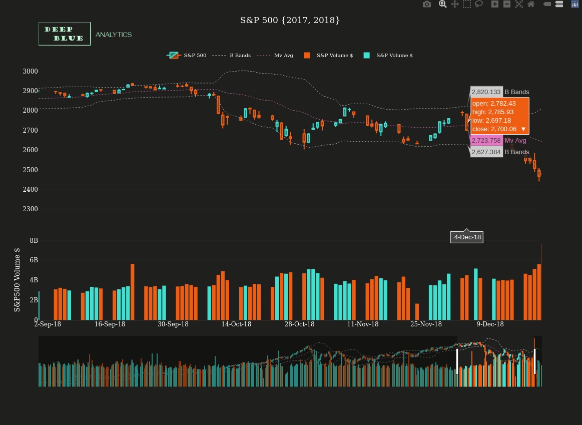
Fig 3. A screenshot of the result of a mouse click and drag interaction performed on Fig. 1 (NB this was the result of zooming into a different section to the zoom slice identified in Fig 2.)
Fig 4. Interactive OHLC time-series chart of 2 years of BTCUSD: 2017 and 2018 represented in 1 day candles, with the both moverage average and bollinger bands (2 standard deviations away from moving average) overlaid. The lower chart shows volume traded in $billions for each day in the 2 year period. As before, various modes of interaction are possible, e.g. mouse click + drag highlights a section of interest, and zooms in. See Figs. 5 and 6 for examples of this. The chart at the bottom is simply an overlay of the OHLC and the Volume charts, and remains unchanged regardless of the degree of zoom in the main charts. It can also be used to track the zoomed section sideways.
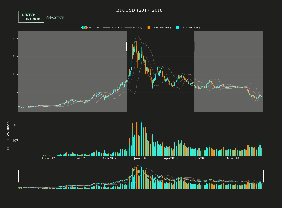
Fig 5. Identical to the earlier S+P 500 plot sequences, this is a screenshot taken of Fig. 4 (BTCUSD) during a mouse click + drag interaction.
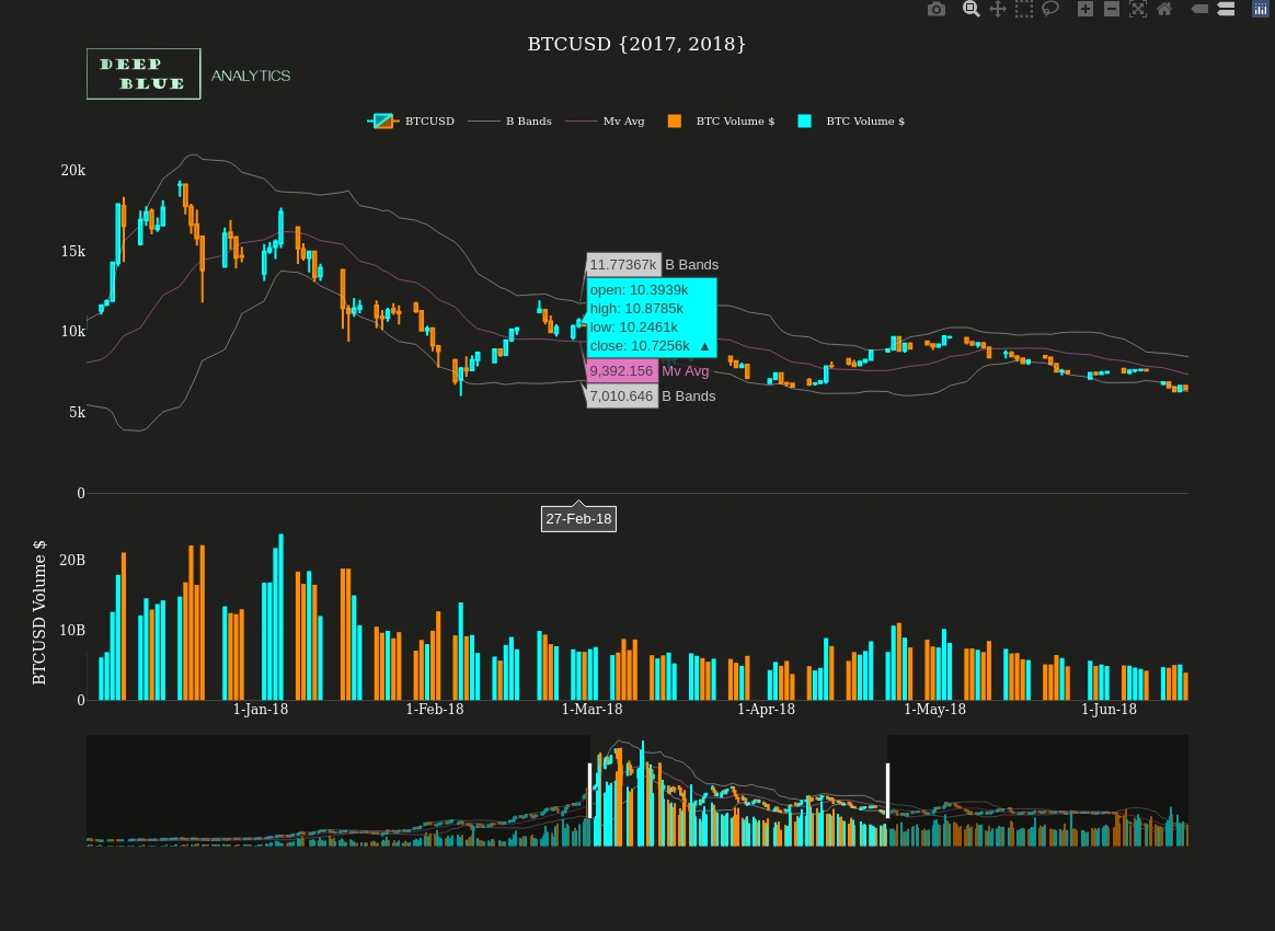
Fig 6. A screenshot of the result of the zoom action captured in Fig 5.
Fig 7. Interactive OHLC time-series chart of the next 2 years of the S+P-500 i.e. 2019 and 2020, again represented in 1 day candles with the both moverage average and bollinger bands overlaid. The lower chart shows volume traded in $billions for each day in the 2 year period. This time we look at the legend interactions, i.e. clicking on a given legend item removes (or restores) its presence from the chart, see Fig 8. for an example of doing this.
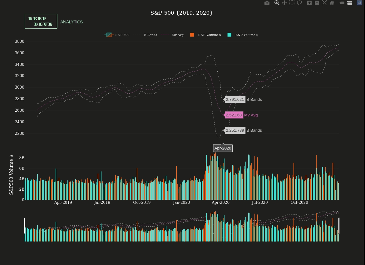
Fig 8. A snapshot taken from Fig. 7 after clicking on the two-tone candlestick section of the legend. This removes the OHLC data completely from the chart, allowing us to see more clearly the underlying trend movements, without the noisy price data.
Fig 9. Interactive OHLC time-series chart of the next 2 years of BTCUSD i.e. 2019 and 2020, again represented in 1 day candles with the both moverage average and bollinger bands overlaid. The lower chart shows volume traded in $billions for each day in the 2 year period. As with the Fig. 7 and 8, this time we look at the legend interactions, i.e. clicking on a given legend item removes (or restores) its presence from the chart, see Fig 10. for an example of doing this.
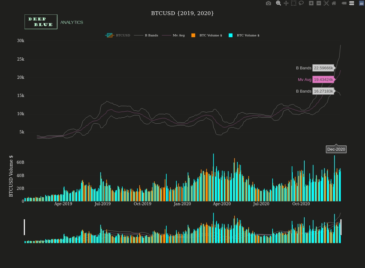
Fig 10. A snapshot taken from Fig. 9 after clicking on the two-tone candlestick section of the legend. This removes the OHLC data completely from the chart, allowing us to see more clearly the underlying trend movements, without the noisy price data. We can now begin to see that there could be some relationship between S+P 500 index movements and the dollar price of bitcoin, however this will become clearer when we overlay the two price time-series, one above the other in Fig 11.
Fig 11. Here both S+P 500 and BTCUSD OHLC charts (for the 2 year period 2017 and 2018) are vertically stacked so that we may better identify similarities between them. Before toggling off the two tone OHLC price data to facilitate this process, we will take a quick look at the box select function in this stacked mode (NB It is worth noting at this stage that any number of time-series charts can be stacked vertically in this way, including for example other technical indicators).
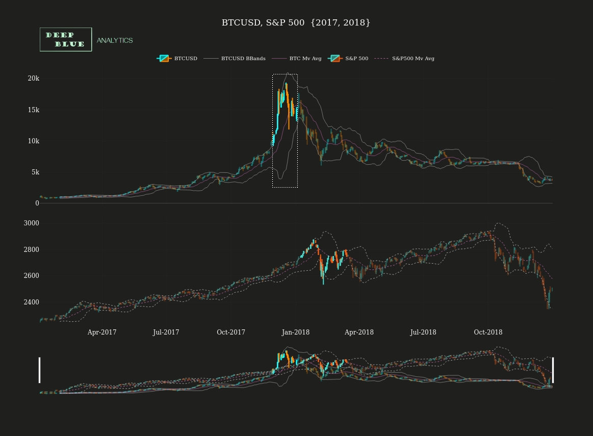
Fig 12. Screenshot taken of Fig. 11 after a box select interaction has been performed on both the upper and lower of the two stacked charts. In doing so we can see what in fact becomes an increasing pattern in the relationship between BTCUSD and S+P 500: that a downward BTCUSD price movement (typically after a bull run) acts as leading indicator of a downward price movement in the S+P 500.
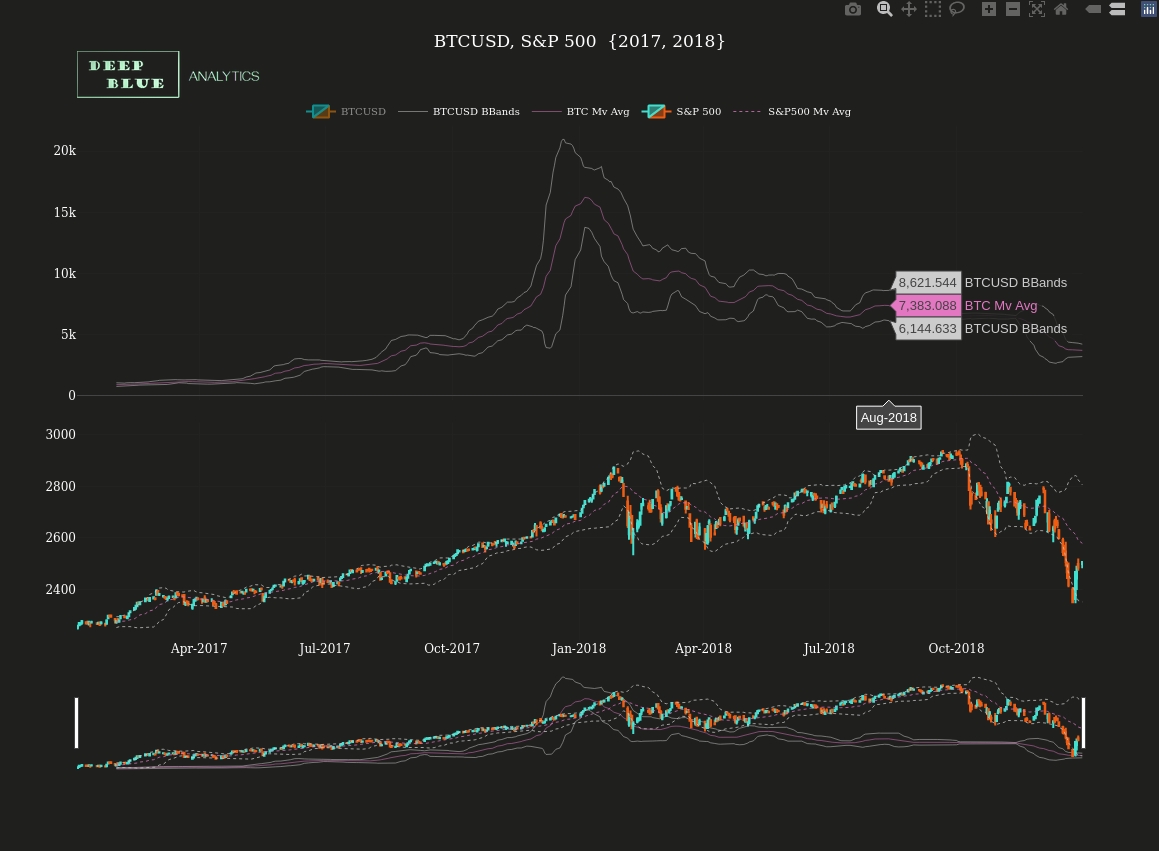
Fig 13. A screenshot taken of Fig 11. after clicking on the two-tone BTCUSD legend item, thereby removing the OHLC price data for bitcoin from the chart.
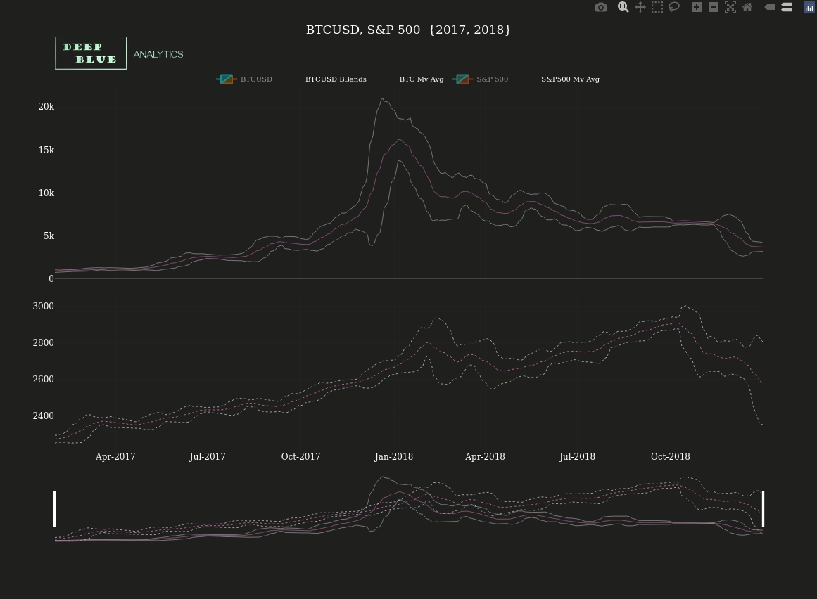
Fig 14. A screenshot of Fig 11., after both BTCUSD and S+P 500 two-tone legend items have been toggled off, thereby removing all noisy OHLC price data from the chart. We can now begin to see more clearly some distinct points of similarity between price movements in these two asset classes: the trending increase throughout 2017, the price jump in Dec-17 and the price fall in Nov-18.
Fig 15. S+P 500 and BTCUSD OHLC charts over the next two year period (2019 and 2020) are again vertically stacked and as before we will toggle off all OHLC price data to better see the underlying trends and similarities (Fig 16), as well as identify possible areas where BTCUSD appears to be acting as a leading indicator for S+P 500 price collapses (Fig 17)
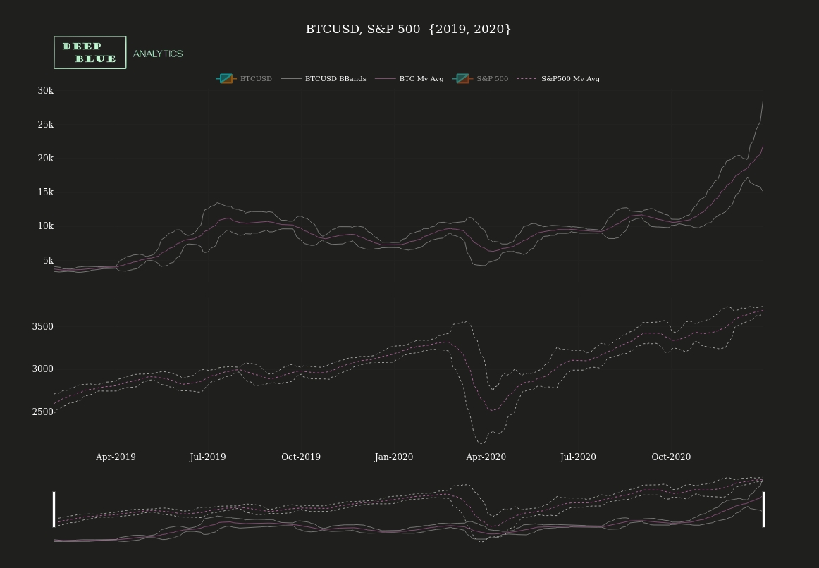
Fig 16. A screenshot of Fig 15., after both BTCUSD and S+P 500 two-tone legend items have been toggled off. Similar to Fig 14. which shows the same charts for the previous two year period, again we can note the similarity between price trends and movements of these two systemically disparate asset classes.
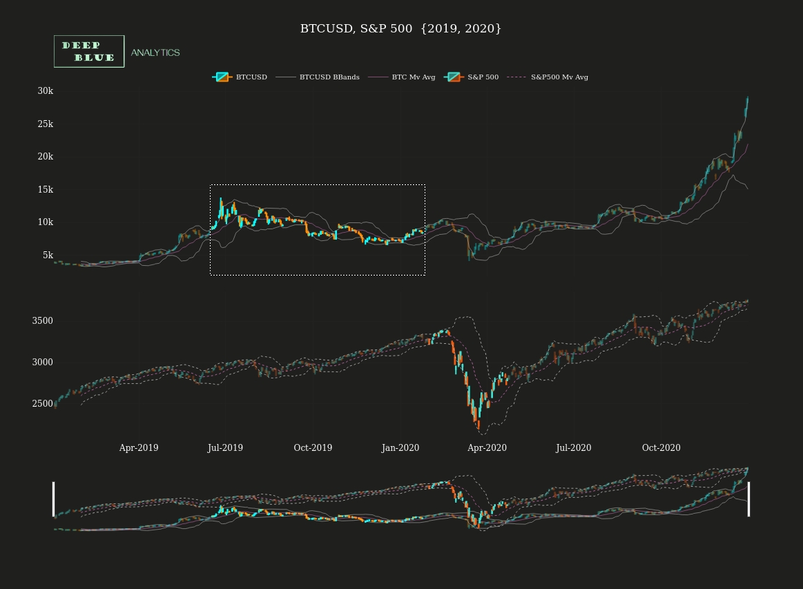
Fig 17. Screenshot taken of Fig. 15 after a box select interaction has been performed on both the upper and lower of the two stacked charts. Again a downward BTCUSD price movement (typically after a bull run) acts as leading indicator of the a downward price movement in the S+P 500.
Fig 18. Finally we have both S+P 500 and BTCUSD OHLC charts across a recent two year period, i.e. 2021 and 2022. Again these are vertically stacked and as before we will toggle off all OHLC price data to better see the underlying trends and similarities (see Fig 19) as well as identify possible areas where BTCUSD appears to be acting as a leading indicator for S+P 500 price movements (Figs 20 and 21)
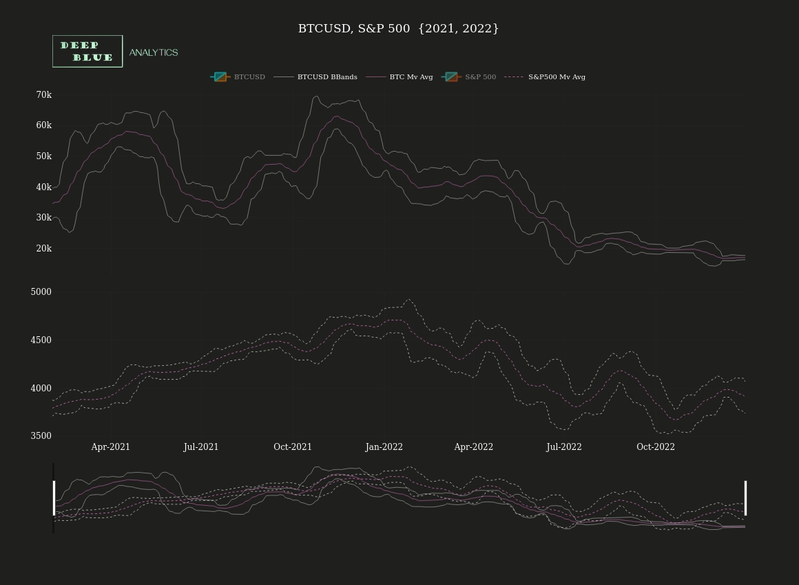
Fig 19. A screenshot of Fig 18., after both BTCUSD and S+P 500 two-tone legend items have been toggled off. Similar to Figs 15 ad 18. which show the equivalent charts for the previous four year period (2017 to 2020), again we can note the similarity between price trends and movements of these two very different asset classes. Why this should be the case though is less clear - S+P 500 is a share index for the 500 top performing US companies and therefore is a bastion of the traditional finance space. Contrastingly bitcoin's vision and technology directly subverts traditional finance. Therefore you would naturally expect falling price in S+P 500 to prompt a rising price in bitcoin, since price failures in the traditional finance space would provoke investors to seek out those asset classes which are not affected by downward price movements in trad-fi, or would actively benefit from such downward price movements and bitcoin being the number one choice here. However this is not the case, and after looking at some more evidence of BTCUSD acting as a leading indicator for S+P500 price corrections, we will perform a brief analysis to identify what is going on here.
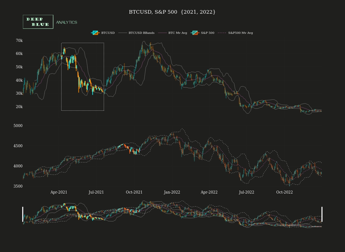
Fig 20. Screenshot taken of Fig. 18 after a box select interaction has been performed on both the upper and lower of the two stacked charts. Again a downward BTCUSD price movement (typically after a bull run) acts as leading indicator of a downward price movement in the S+P 500.
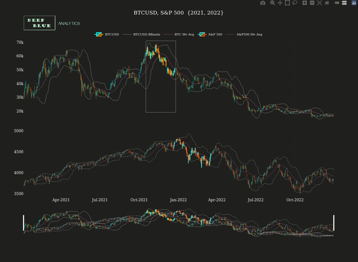
Fig 21. Screenshot taken of Fig. 18 after a box select interaction has been performed on both the upper and lower of the two stacked charts. Again a downward BTCUSD price movement (typically after a bull run) acts as leading indicator of a downward price movement in the S+P 500.
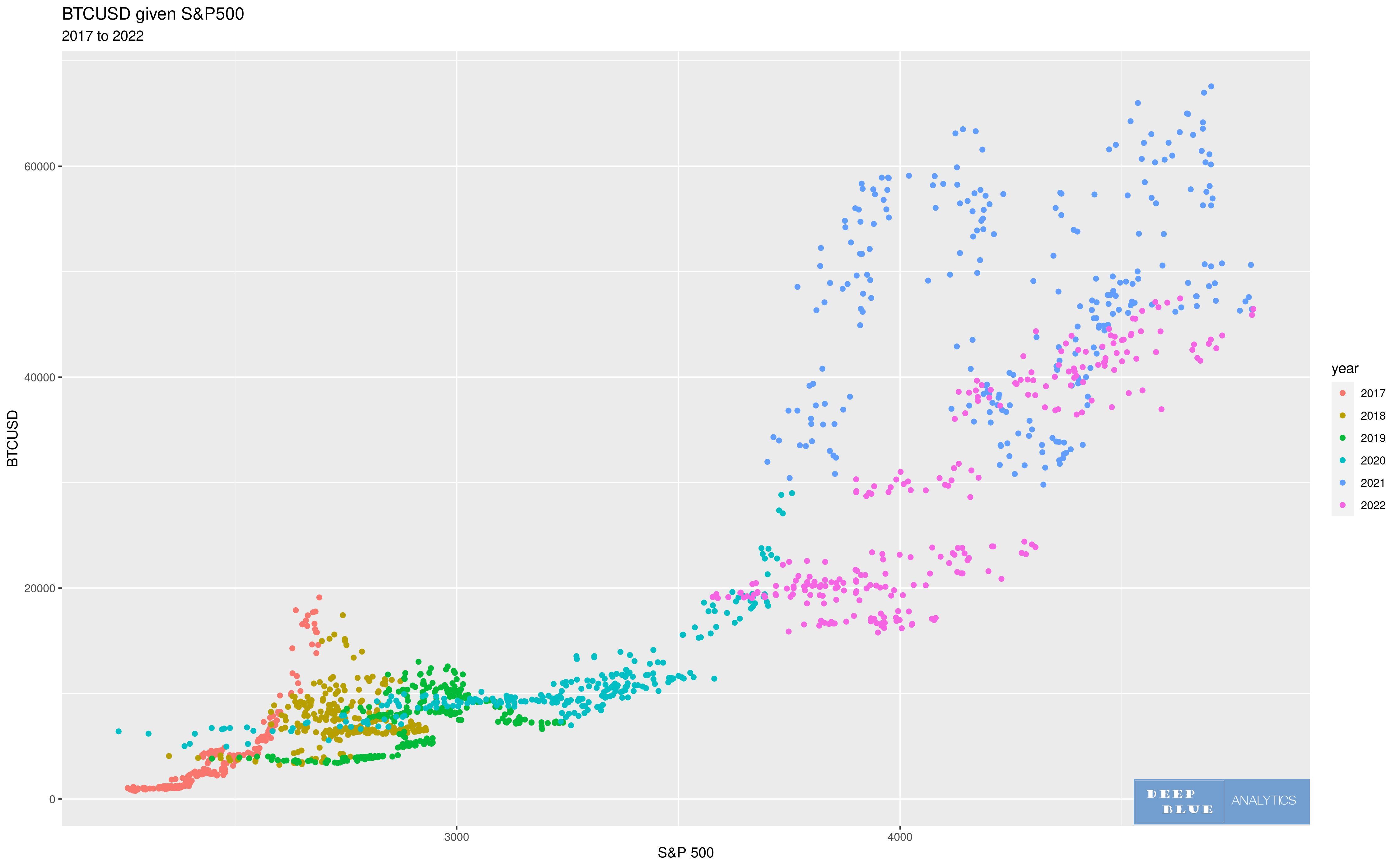
Fig 22. This is a plot of the daily closing value of the S+P 500 index (x-axis) and daily closing dollar price of bitcoin (y-axis) over the 6 year period 2017 to 2022. Each dot corresponds to a single day, and each dot is coloured according to the year in which that day occurred. From this plot we can begin to see the general functional relationship between S+P 500 and BTCUSD.
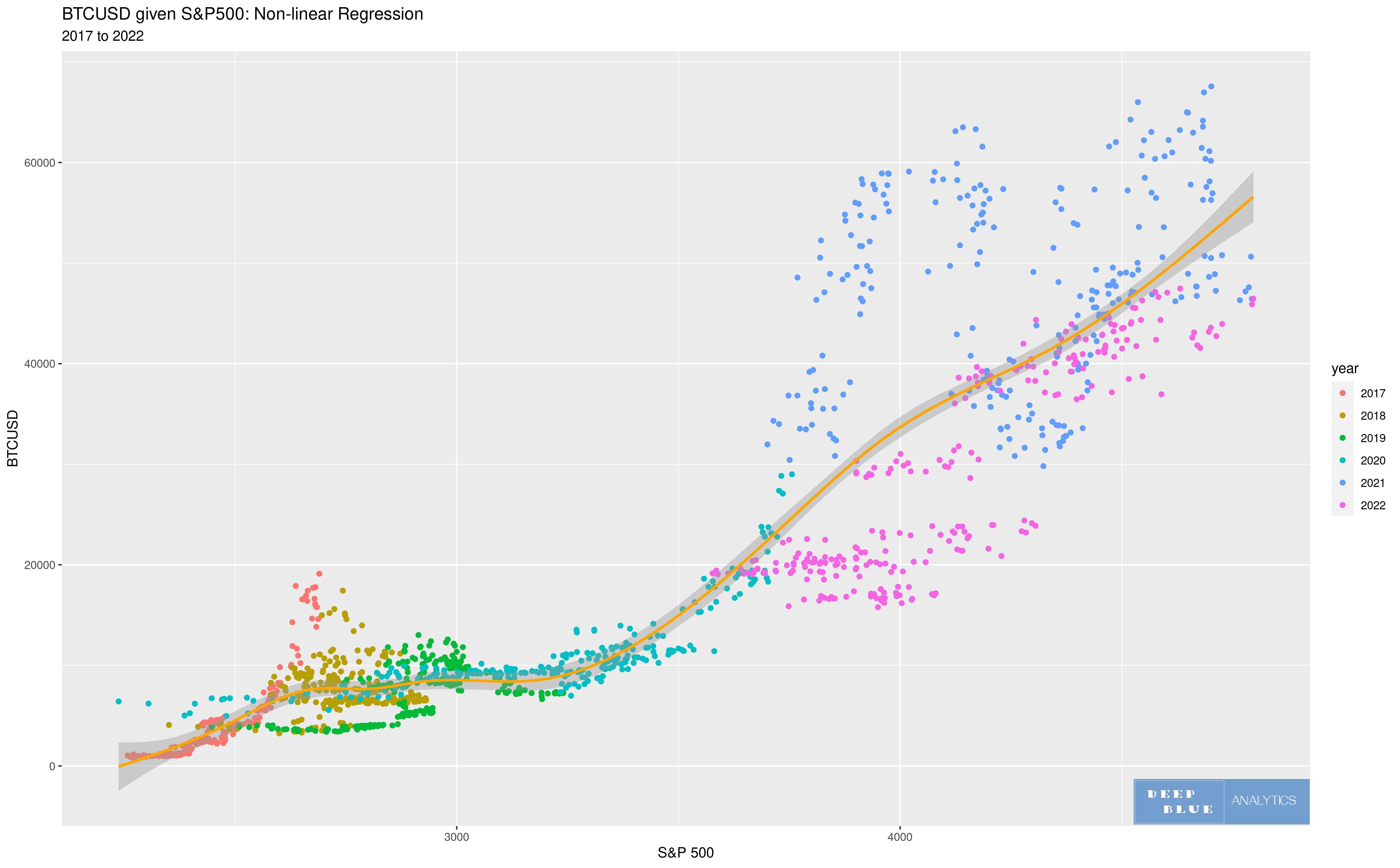
Fig 23. The positive correlation between S+P 500 and BTCUSD can be further clarified, by overlaying the regression line (a single line of best fit) onto the scatterplot. In this chart we perform a non-linear regression, as there are strong non-linear characterists to the relationship between these two variables.
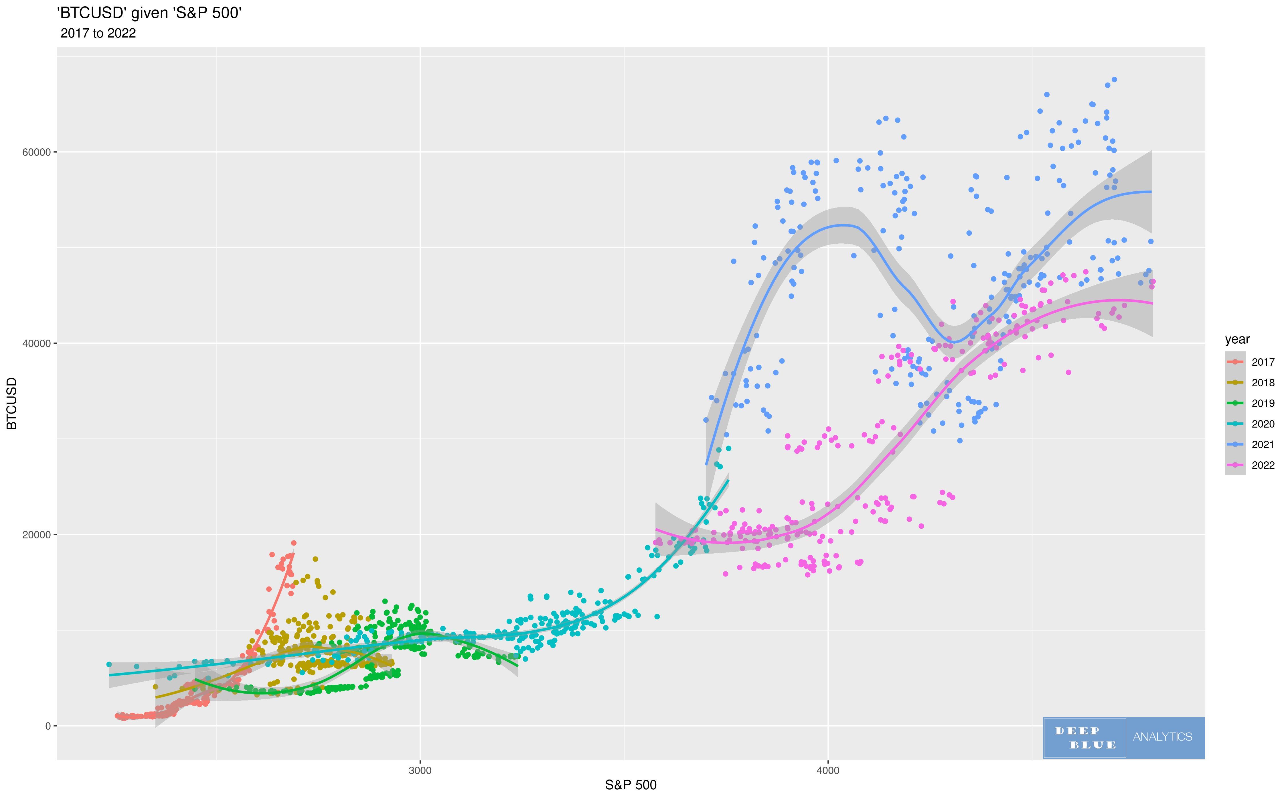
Fig 24. Here the scatterplot is identical to that in Figs 20 and 21, but this time we perform a separate non-linear regression for each year in the 6 year period 2017 to 2022, since clearly the relationship between S+P 500 and BTCUSD does vary according to prevailing macroeconomic conditions.
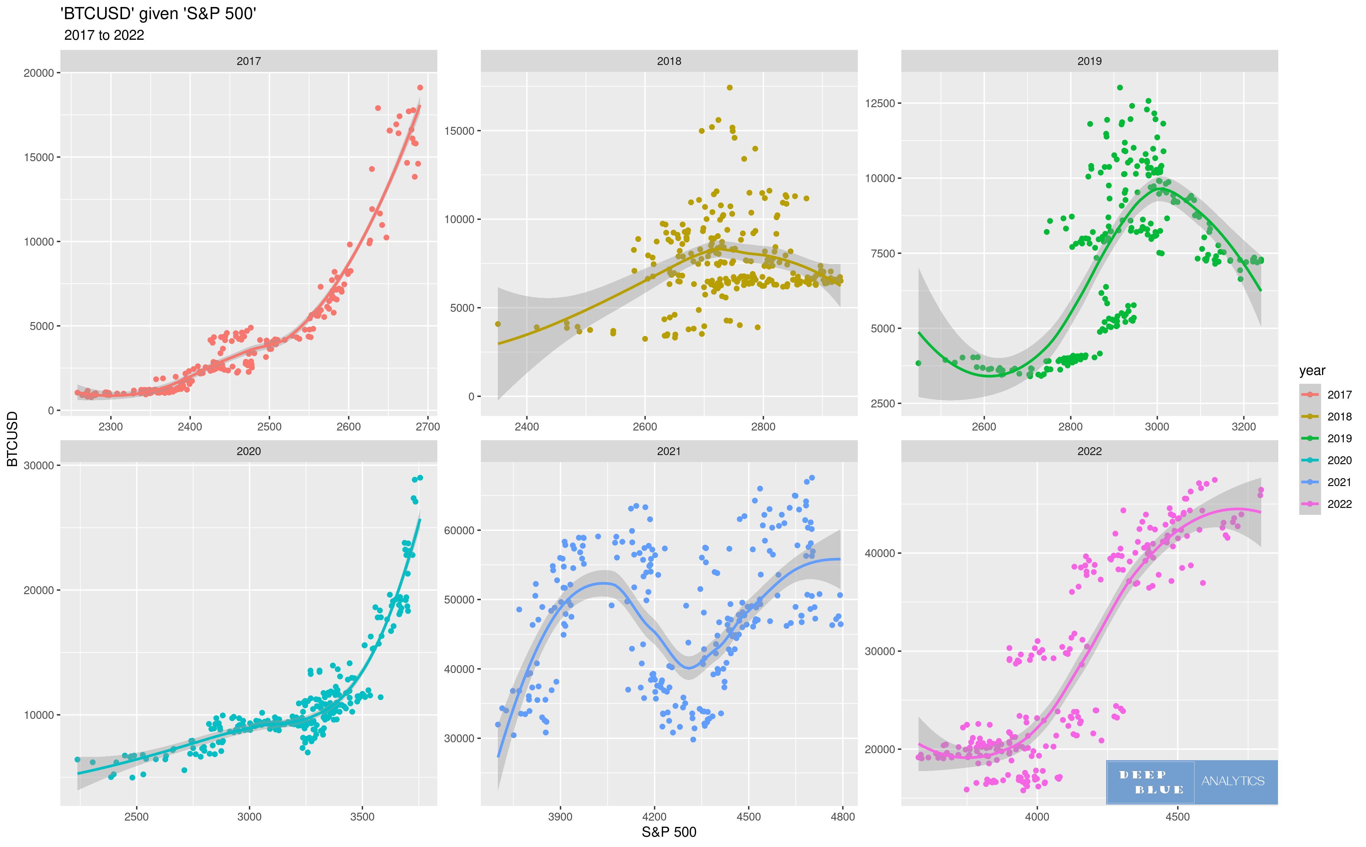
Fig 25. Here the same scatterplot has been separated into six subplots, one for each year in the period 2017 to 2022 and a non-linear regression performed in each. It is therefore the same as Fig 24. but clearer to read, as the year groups are now separated and scaled identically.
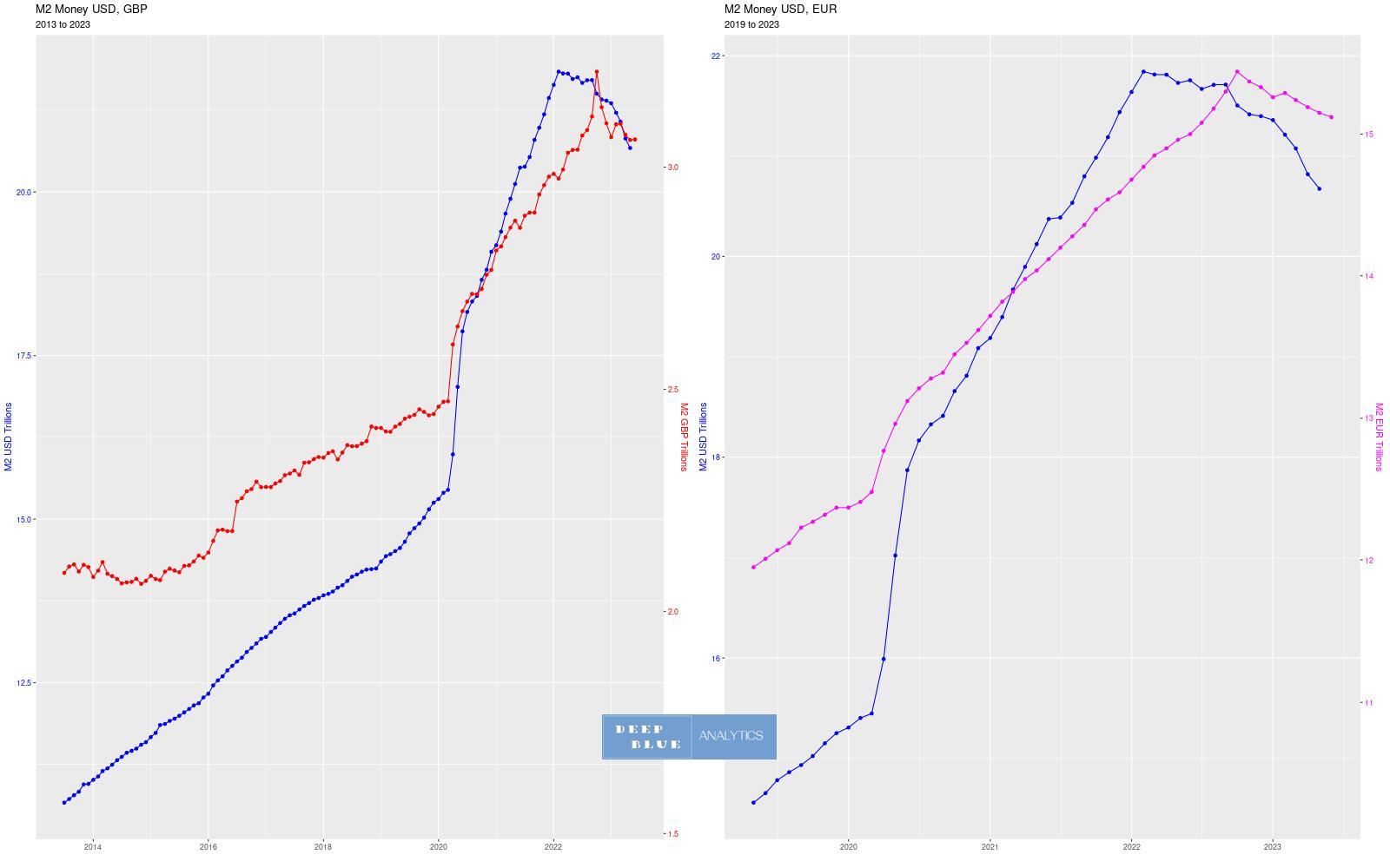
Fig 26. M2 money is a measure of the money supply that includes all cash, all deposits held by commercial banks (although typically it excludes large institutional cash deposits) as well as other types of deposits which are readily convertible to cash. Economists usually use the M2 number when discussing the total money supply for a given currency. The left-hand chart above, shows the monthly US dollar M2 money supply plotted in blue (against left axis), with the monthly UK GBP M2 money supply plotted in red for the same period, i.e. 2014 to 2023. Similarly the right-hand chart above shows the shows the monthly US dollar M2 money supply plotted in blue (against left axis), with the monthly Eurozone Euro money supply plotted in purple for the period 2019 to 2023. Of note is that the US dollar money supply increased from $13 trillion to $21.5 trillion between Jan-2017 to Jan-22, whereupon it shrank by approx $1 trillion during the course of 2022, to a total of $20.5 trillion.
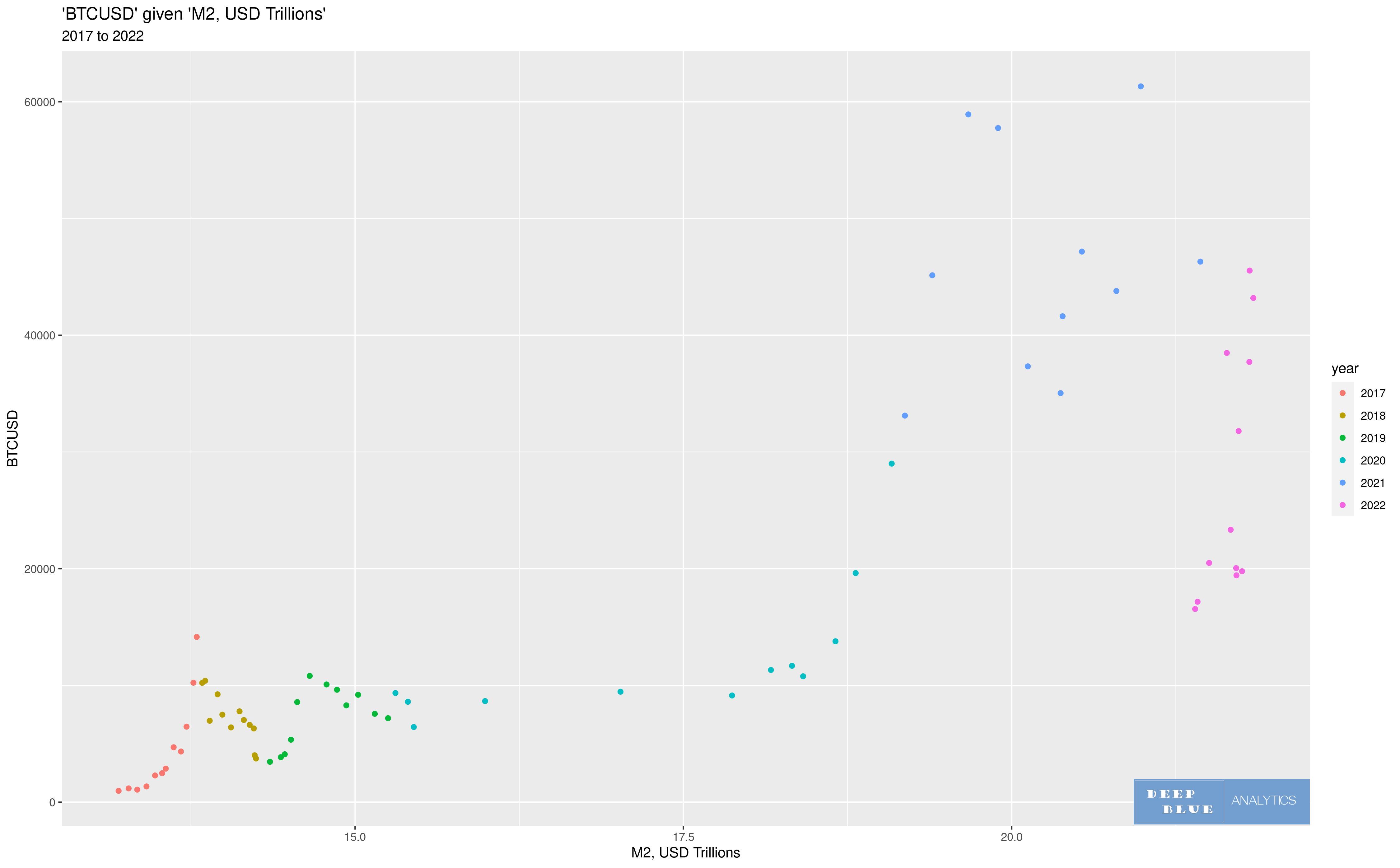
Fig 27. Instead of plotting BTCUSD as a function of S+P 500, here we plot BTCUSD as a function of the USD M2 money supply, i.e. the closing monthly BTCUSD is plotted against the US dollar money supply for that month. Again points in the scatterplot are coloured by year.
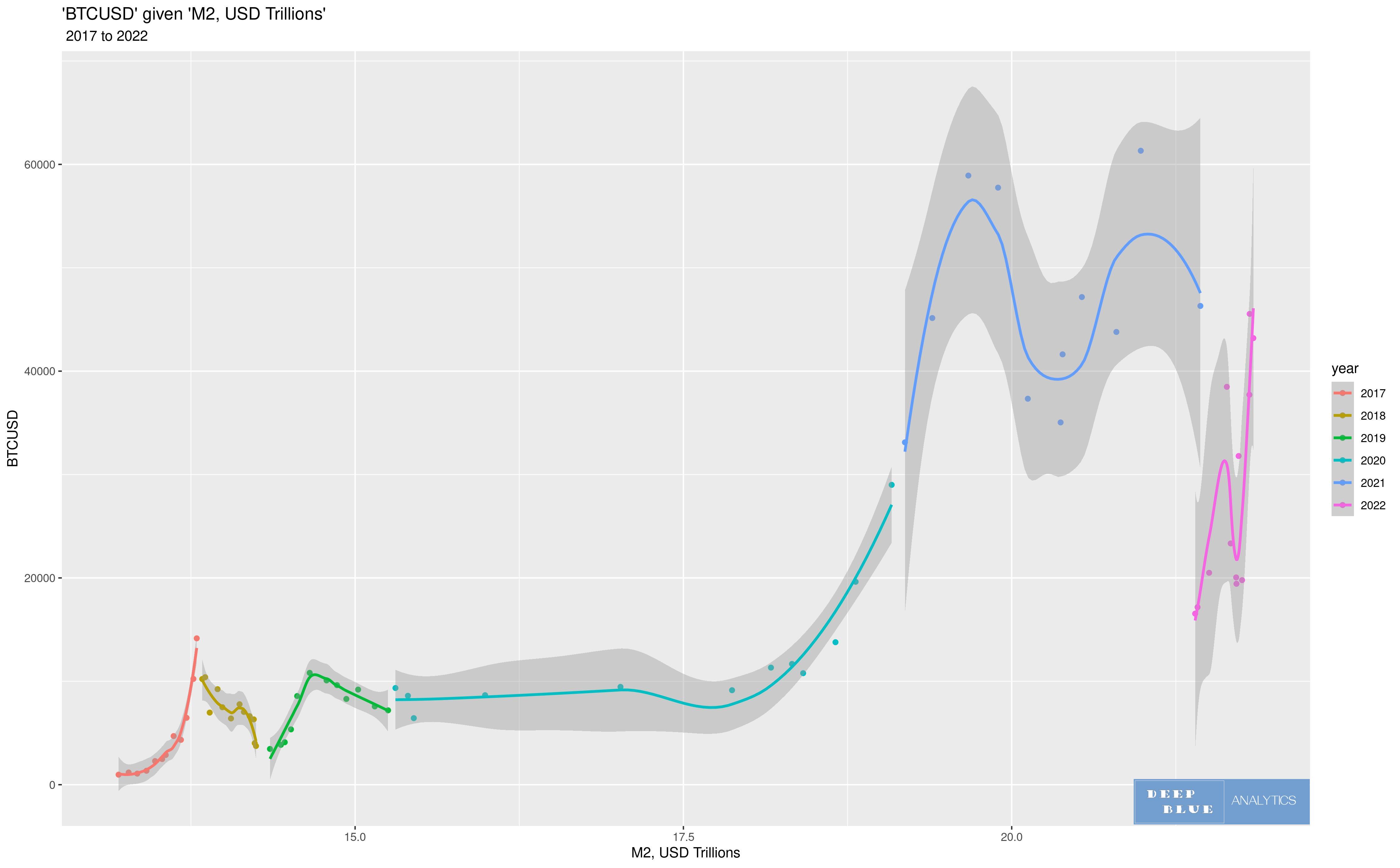
Fig 28. Using the same scatterplot shown in Fig 27, we now perform a non-linear regression by year
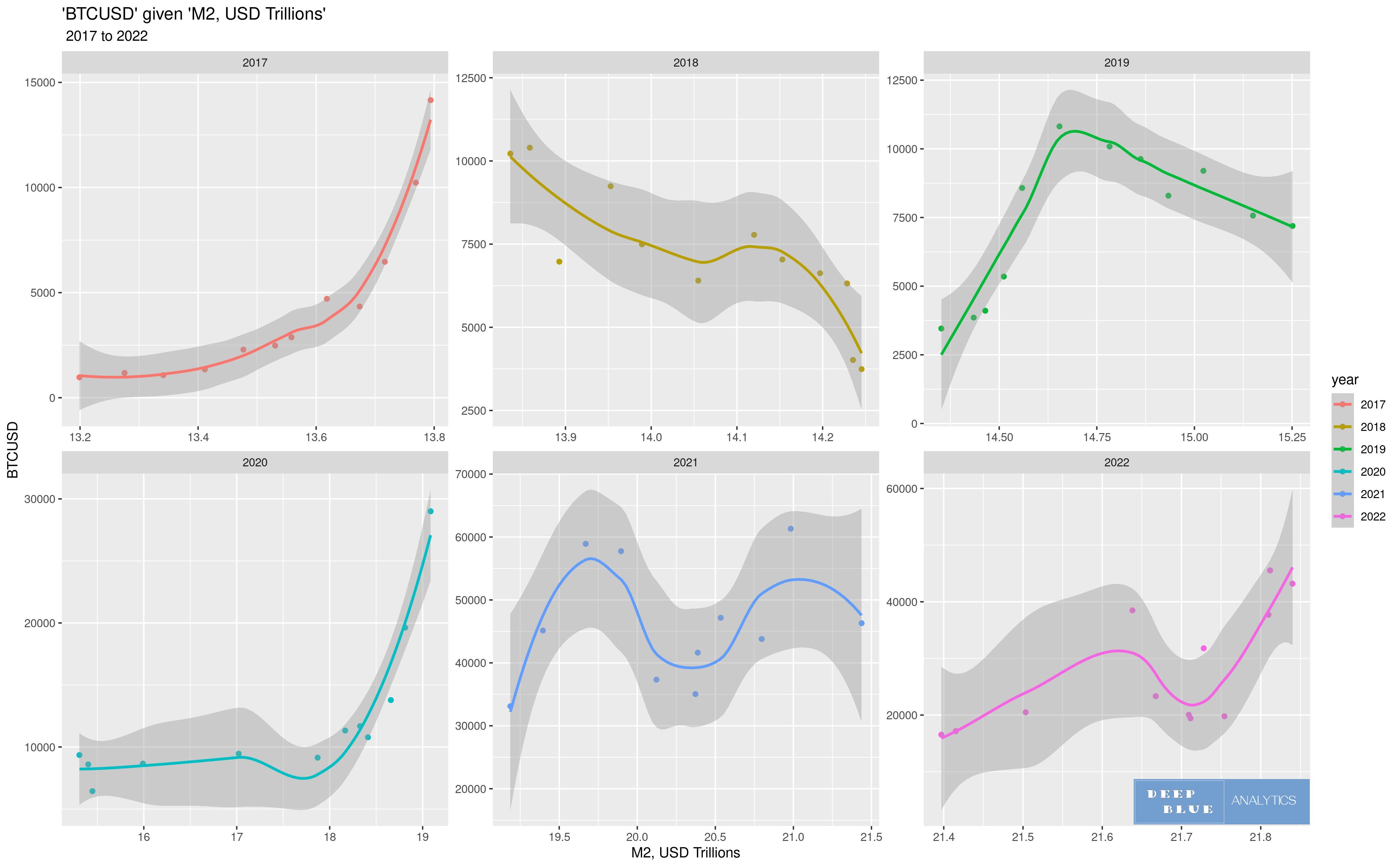
Fig 29. Here the same scatterplot has been separated into six subplots, one for each year in the period 2017 to 2022 and a non-linear regression performed in each. It is therefore the same as Fig 28. but clearer to read, as the year groups are now separated and scaled identically.
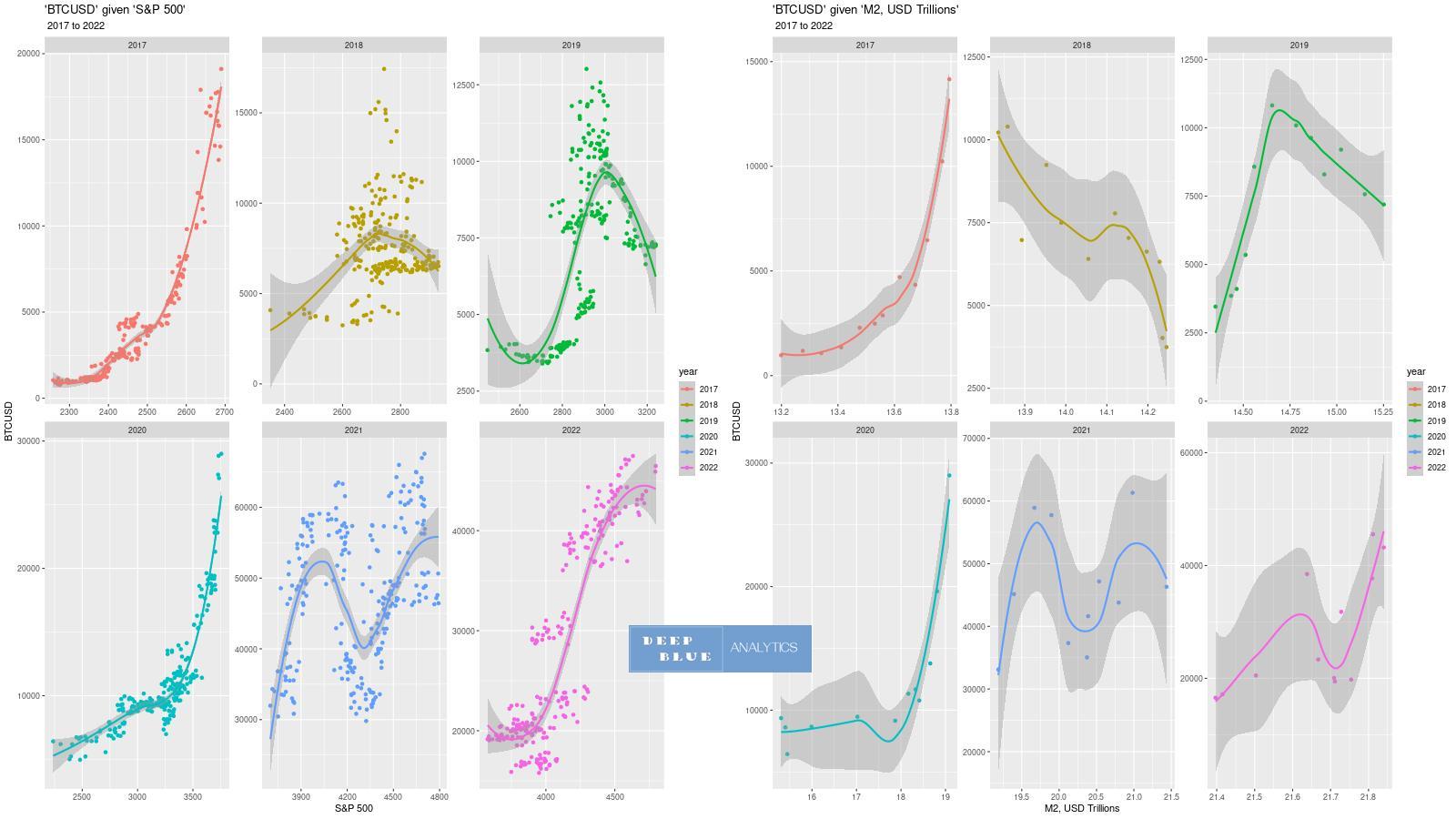
Fig 30. This is really the pith of the matter. On the left we have BTCUSD as a function of S+P 500 and on the right we have BTCUSD as a function of the US dollar M2 money supply. In every year, perhaps with the exception of 2018, the functional relationship between BTCUSD and S+P 500 is more or less identical to the functional relationship between BTCUSD and M2 money, i.e. the value of the S+P 500 index is not per se relevant to the price of bitcoin, but because its value is somehow in direct linear correlation to the M2 money supply then the S+P 500 serves simply a proxy for the analagous (but generally non-linear) relationship BTCUSD has with the dollar M2 money supply. In other words the amount of liquidity in the market is the primary driver for price of any asset class, regardless of the underlying macro-econimic parameters which might be considered essential to pricing that asset (e.g. pe ratios, crypto halving cycles etc - though these certainly have an effect)