Fig 1. A 3D scatterplot looking at the relationship between x = daily closing dollar price of bitcoin (BTCUSD), y = trading volume of BTCUSD ($billions per day) and z = daily closing value of the S+P 500 index, across the 7 year time period 2016 to 2022. Each (x, y, z) dot is coloured by year. The plot is fully interactive, e.g. click and drag to rotate etc.
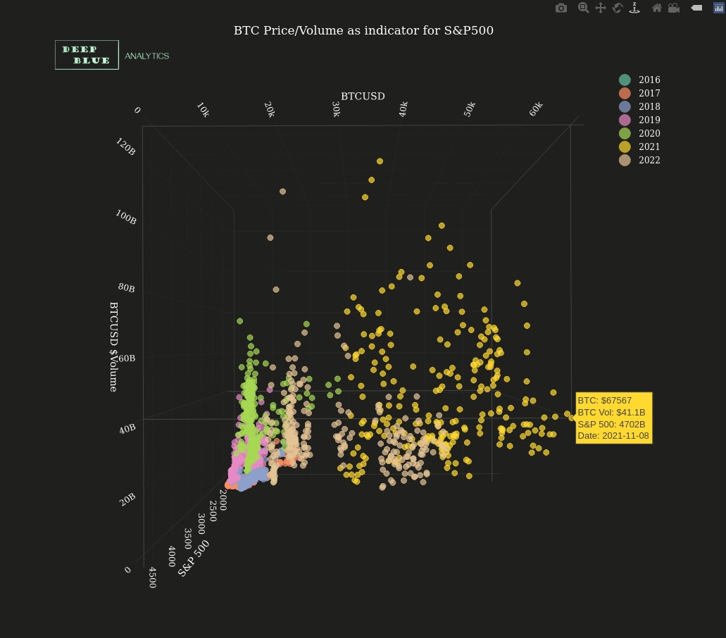
Fig 2. A screenshot taken from Fig 1. after rotating it round to show the relationship solely between x = BTCUSD and y = BTCUSD volume. Typical to the overall non-linear shape of the plot, the BTCUSD and BTCUSD volume relationship is also non-linear, with low prices (i.e. less than $15K) pre 2020 correlating to relatively low volume and then very high prices (i.e. greater than $60K) also correlating to relatively low volume, with the rest of price distribution typically correlating to high volume.
Fig 3. The same 3D scatterplot shown in Fig 1, but with a best-fit 3D non-linear regression surface overlaid. This non-linear regression surface reveals the functional relationship between x = BTCUSD, y = BTCUSD volume and z = S+P 500 (see 'Finance + Markets' section of the portfolio for more info). Of note is that the 2022 data conforms well to the model despite the massive price collapse of late 2021, i.e. regardless of price growth or price collapse the same model applies. In general, a multivariate non-linear regression surface such as this can be used to predict unknown values of the target variable (in this case the z variable). As with Fig 1, the plot is fully interactive, e.g. click and drag to rotate etc.
Fig 4. A 3D scatterplot looking at the relationship between x = daily closing value of S+P 500 index, y = trading volume of the S+P 500 ($billions per day) and z = daily closing dollar price for bitcoin (BTCUSD), across the 7 year time period 2016 to 2022. As before each (x, y, z) dot is coloured by year and the plot is fully interactive, e.g. click and drag to rotate etc.
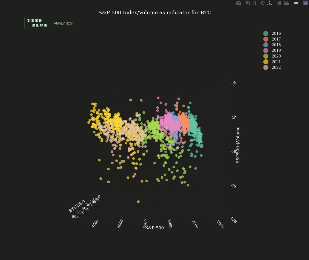
Fig 5. A screenshot taken from Fig 4. after rotating it round to show the relationship solely between x = daily S+P 500 index value and y = S+P daily volume ($billions). In contrast to Fig 2. there is no particular relationship here since volume for S+P 500, being among the most traded portfolio of equities in the world, remains fairly constant.
Fig 6. The same 3D scatterplot shown in Fig 4, but with a best-fit 3D non-linear regression surface overlaid. This non-linear regression surface reveals the functional relationship between x = S+P 500, y = S+P 500 volume and z = BTCUSD (see 'Finance + Markets' section of the portfolio for more info). Since there is no particular relationship between the S+P 500 and its corresponding trading volume on any given day, the 3D surface collapses to a 3D plane, which suggests we can remove the S+P 500 trading volume entirely from the model. Also of note is that the 2022 data conforms well to the model despite the massive price collapse of late 2021, i.e. regardless of price growth or price collapse the same model applies. In general, a multivariate non-linear regression surface such as this can be used to predict unknown values of the target variable (in this case the z variable). As with Fig 4, the plot is fully interactive, e.g. click and drag to rotate etc.
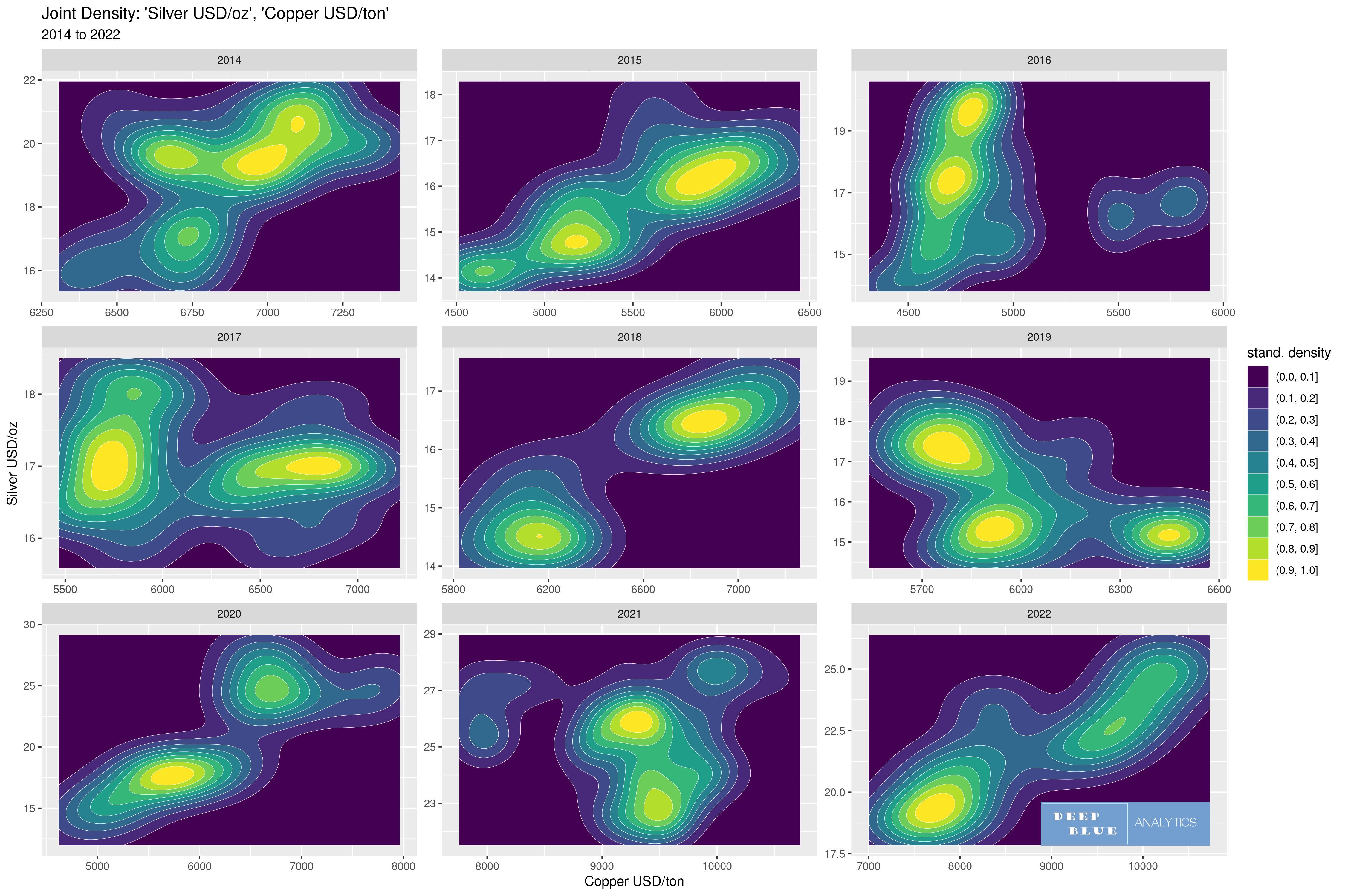
Fig 7. Here we look at the relationship between x = USD price of copper per ton and y = USD price of silver per ounce, over the 9 year period 2014 to 2022. We could of course do so with 9 2D scatterplots, however a 3D plot of the joint density between two variables provides us with different information from the 2D scatterplot yet retains much of the same information (but not all) from the scatter. The simplest representation of a 3D joint density, is to use a 2D contour plot which expresses the 3rd dimension, i.e. the z dimension, in the form of contour lines linking areas of equal value, and in the above case these contours are then coloured according to increasing value. The question we are seeking to answer from the data is: Is the behaviour of silver changing? Does it increasingly act like an industrial metal (such as copper) and less like a monetary metal?
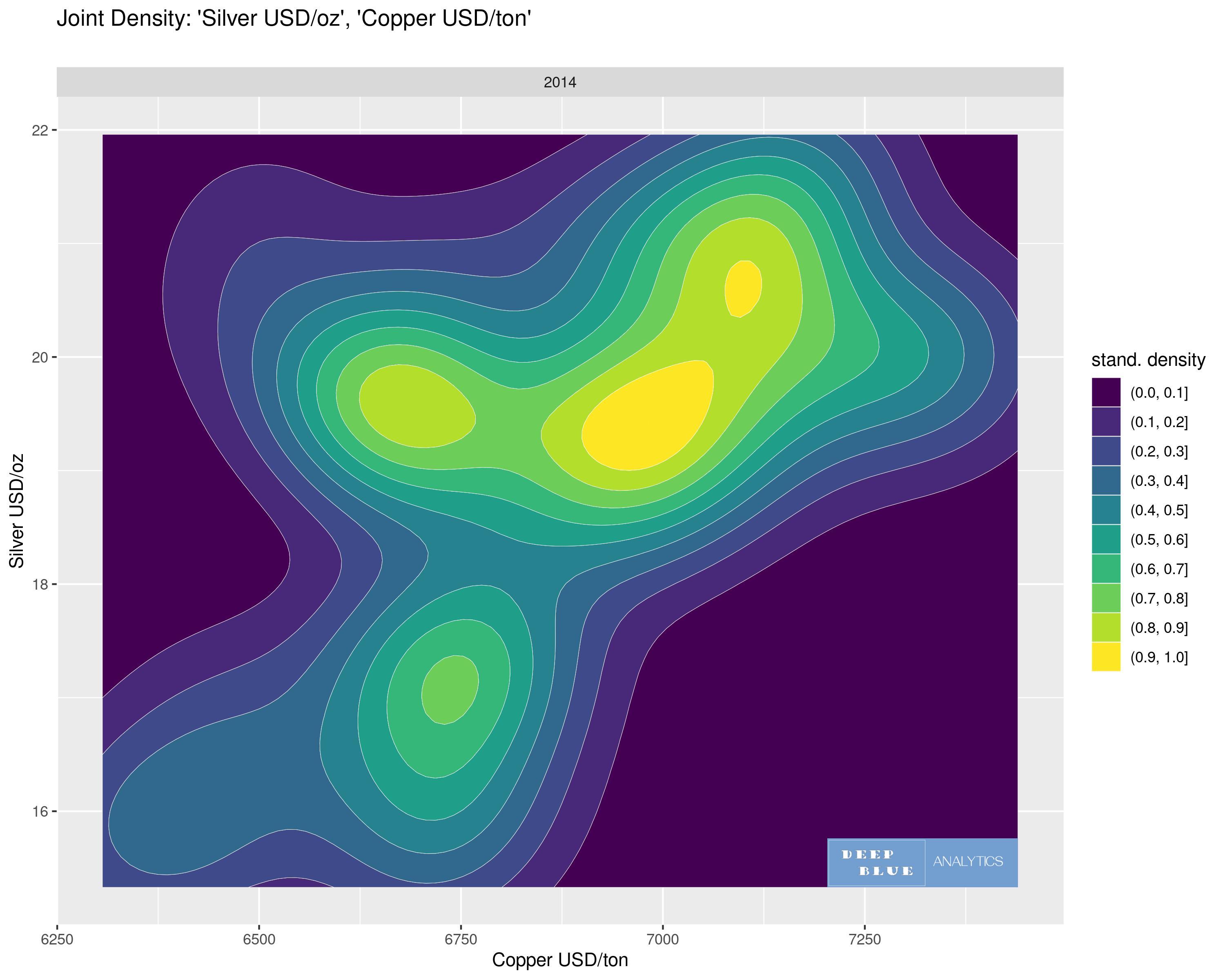
Fig 8. A 2D contour plot depicting the 3D joint density of two variables: the USD price of Silver per oz and the USD price of Copper per ton for 2014 only. We can compare this with Fig 9. which is a fully 3D interactive depiction of this contour plot.
Fig 9. A 3D joint density of two variables: x = USD price of Silver per oz, y = USD price of Copper per ton for 2014 only. The vertical or z dimension to the plot is, approximately speaking, the observed probability, i.e. z = how likely is the coincidence of a particular price of silver AND a particular price of copper (NB the probability is unitless and when normalised, the total probability = area under the entire plot = 100% = 1). The plot is fully interactive, e.g. click and drag to rotate
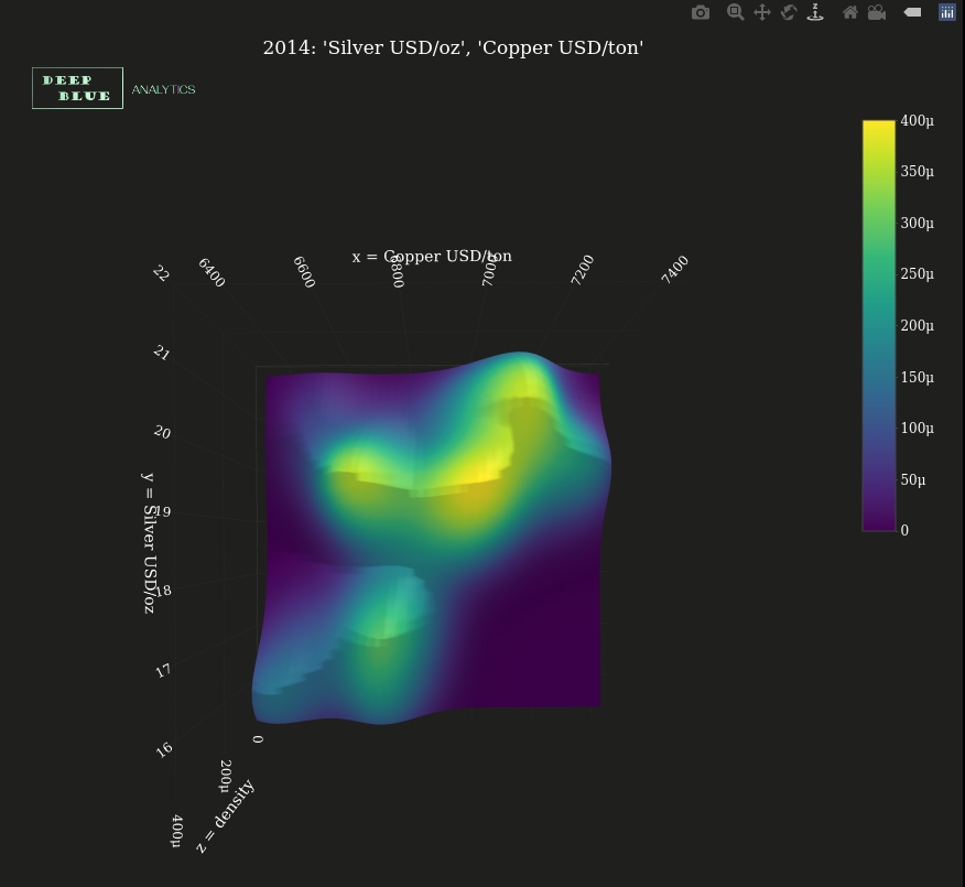
Fig 10. A screenshot of Fig 9. after rotating the 3D density plot round to show the aerial view, i.e. looking down the z axis. This shows how the 2D contour plot depicted in Fig 8. captures a summary of the same information depicted in the full 3D density (Fig 9.)
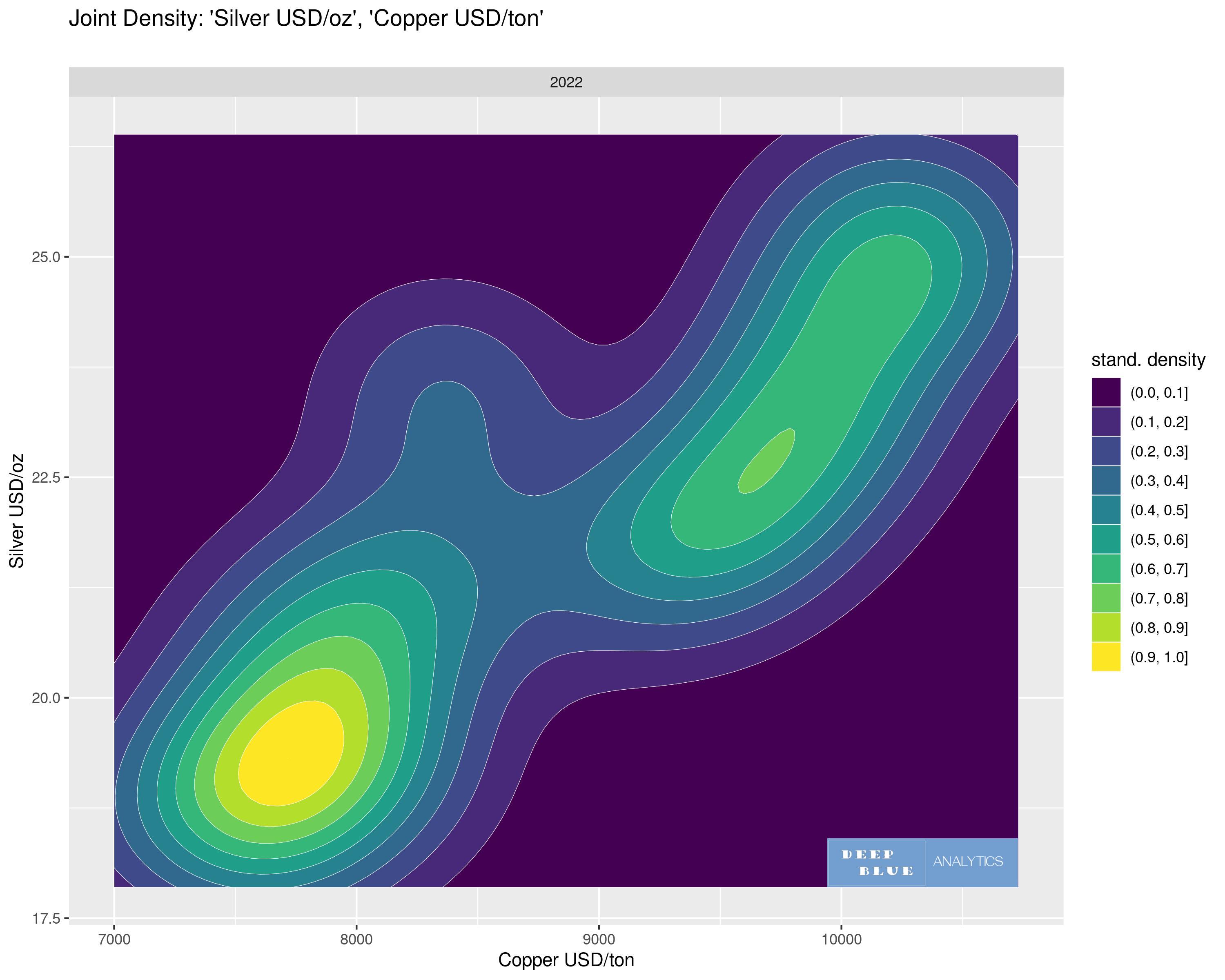
Fig 11. A 2D contour plot depicting the 3D joint density of two variables: the USD price of Silver per oz and the USD price of Copper per ton for 2022 only. We can compare this with Fig 12. which is a fully 3D interactive depiction of this contour plot.
Fig 12. A 3D joint density of two variables: x = USD price of Silver per oz, y = USD price of Copper per ton for 2022 only. The vertical or z dimension to the plot is, approximately speaking, the observed probability, i.e. z = how likely is the coincidence of a particular price of silver AND a particular price of copper (NB the probability is unitless and when normalised, the total probability = area under the entire plot = 100% = 1). The plot is fully interactive, e.g. click and drag to rotate
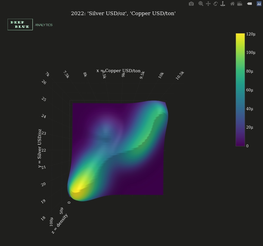
Fig 13. A screenshot of Fig 12. after rotating the 3D density plot round to show the aerial view, i.e. looking down the z axis. This shows how the 2D contour plot depicted in Fig 11. captures a summary of the same information depicted in the full 3D density (Fig 12.)
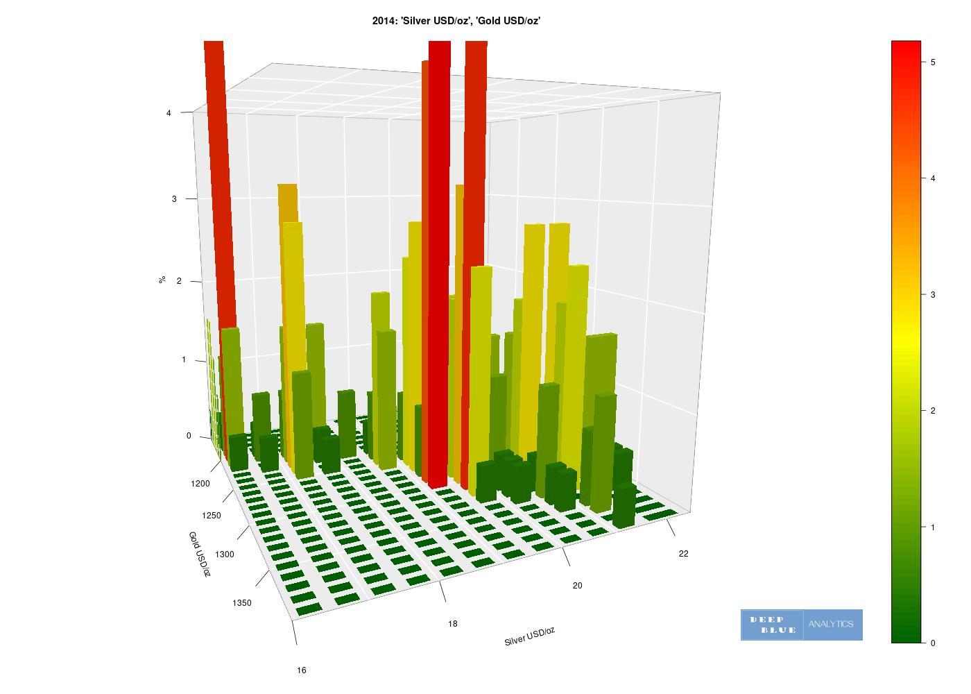
Fig 14. A 3D histogram depicting the relationship between two variables: x = USD price of gold per ounce, y = USD price of silver per ounce during 2014 only. Similar to a 3D joint density, the z dimension of this histogram shows the probability of a particular price of gold occuring coincidentally with a particular price of silver. Of note is that this 3D plot is not interactive, hence we may benefit from generating the same plot with a different viewing angle (see Fig 15.)
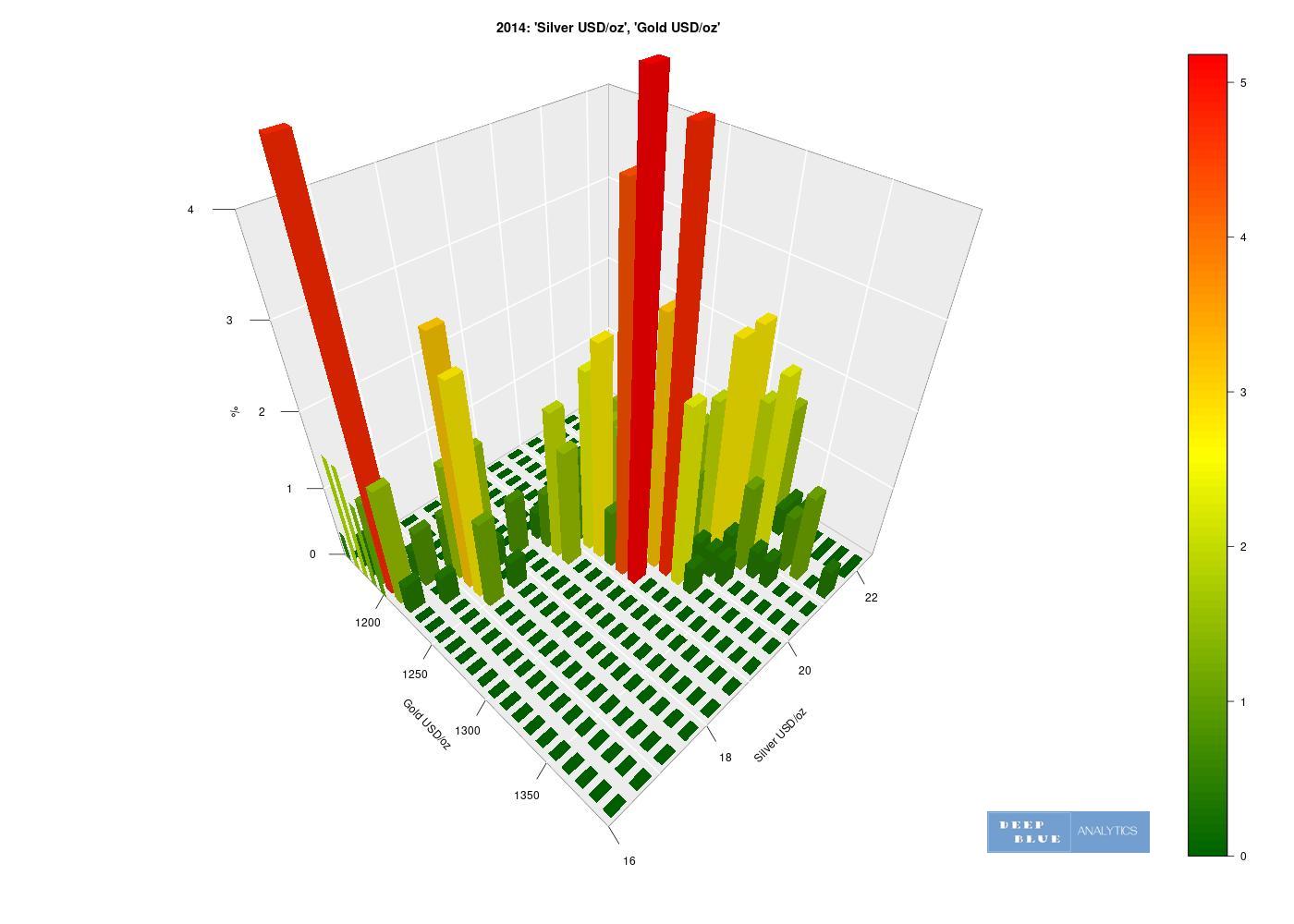
Fig 15. Identical plot to Fig. 14 but with the viewing angle adjusted. From this angle we can better see the underlying functional relationship between the price of silver and the price of gold in 2014
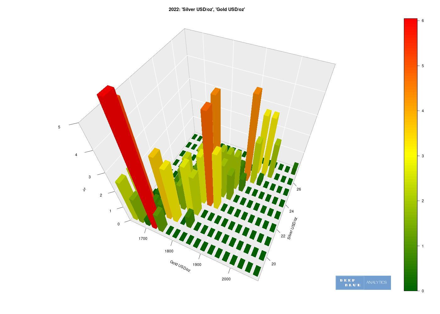
Fig 16. A 3D histogram depicting the relationship between two variables: x = USD price of gold per ounce, y = USD price of silver per ounce during 2022 only. Similar to a 3D joint density, the z dimension of this histogram shows the probability of a particular price of gold occuring coincidentally with a particular price of silver. Of note is that this 3D plot is not interactive, hence we may benefit from generating the same plot with a different viewing angle (see Fig 17.)
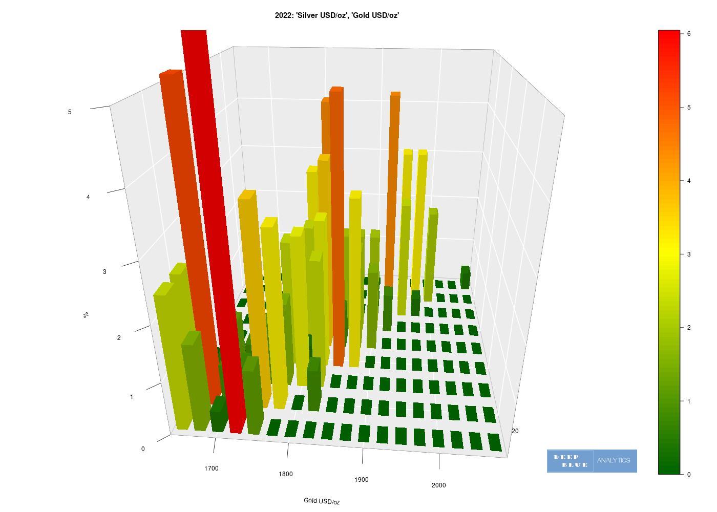
Fig 17. Identical plot to Fig. 16 but with the viewing angle adjusted. From this angle we can better see the falling density in the functional relationship between the price of gold and the price of silver.